Here are a few examples of reports that can be created with Scheduler Analytics:
Appointment Type Counts/% over Date Range
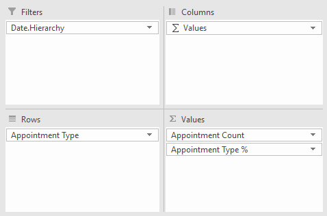
- First, drag the desired fields to the PivotTable areas. Please note that 'Values' is not a field that you need to add to the Columns area -- it's automatically populated if more than one measure is added to the Values section, to denote that you'll have columns associated with each value.
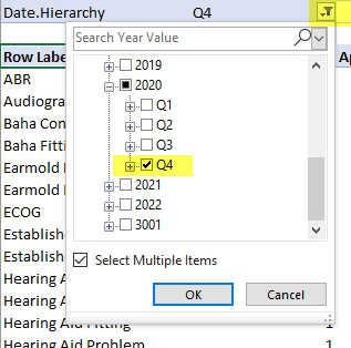
- Next, apply the desired date filter by clicking on the filter icon where the filter is listed at the top of the report:
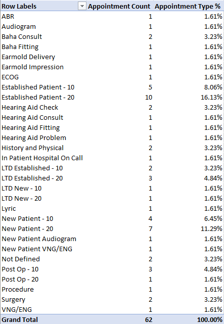
- You can now see the desired output, appointment type counts and percentage, filtered to the desired date range:


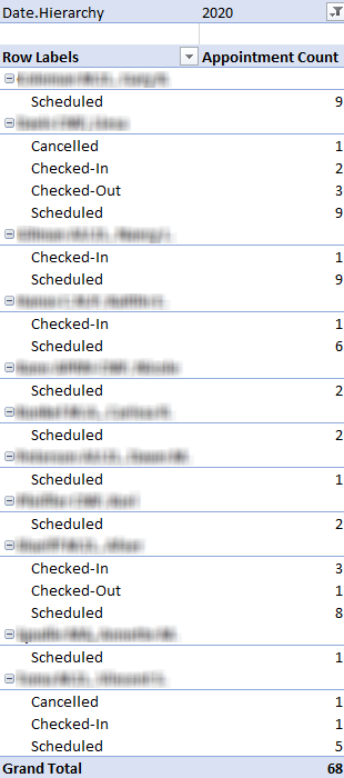
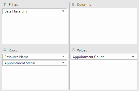
Appointment Count by Resource by Appointment Status over Date Range
- First, drag the desired fields to the PivotTable areas.
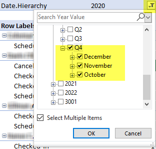
- Next, apply the desired date filter by clicking on the filter icon where the filter is listed at the top of the report:
- You can now see the appointment counts by resource and status, filtered to the desired date range: