In Billing Analytics, you have the option of adding a chart that connects to your practice's data. This chart can make use of all the same fields as PivotTables, and can even be connected with slicers. To add a chart, take the following steps:
- Navigate to the worksheet where you would like the chart to appear.
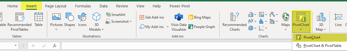
- At the top of the screen, select Insert, then Pivot Chart, then Pivot Chart. Note: If you would like to add a PivotChart and a PivotTable that displays the same data but in numerical format, you can instead select PivotChart & PivotTable.
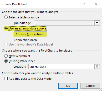
- Select Use an external data source, and select Choose Connection:
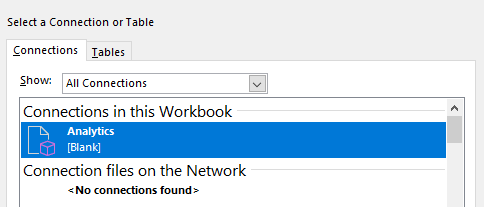
- In the resulting window, select your connection and hit OK, then hit OK again:
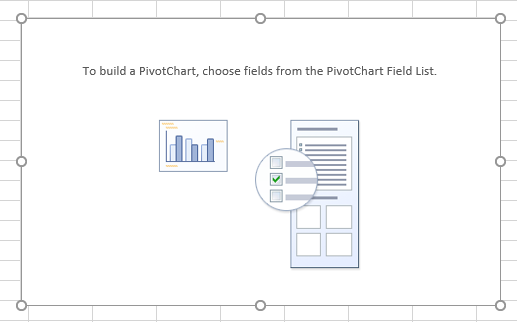
- You will see a blank PivotChart:
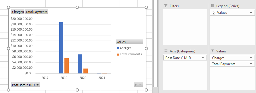
- You can build the chart just like a PivotTable, adding fields in the pane at the right to build your chart. For instance, here is a basic chart showing Charges and Payments by Post Date: